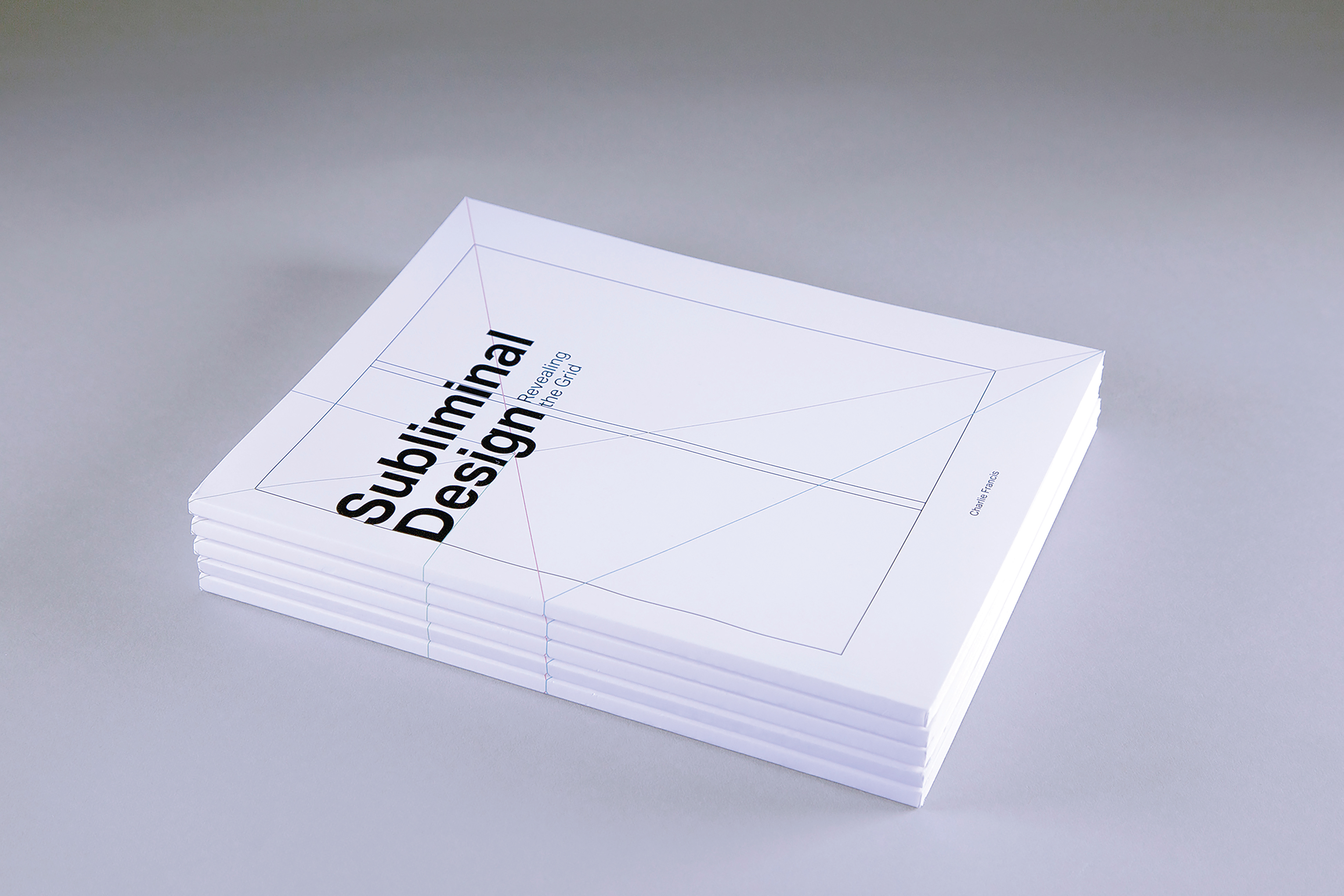
Subliminal Design: Revealing the Grid
A book design and in-depth study of grids systems in design.
Grids are all around us—from the pages of a book, to the very streets we walk. If you look close enough, they can be found everywhere in the foundation of buildings, and in the human form. A grid, in its essence, is an invisible structure. Grids are the underlying principle that guide form and function, while also being a pivotal way to structure information and content in all forms of design, both 2-dimensional and 3-dimensional.
Subliminal Design: Revealing the Grid explores areas of design that utilize grid systems, while exposing the invisible patterns we interact with every day. Featuring articles and excerpts from designers of the past and present, this book promotes a human-centered approach to understanding design.
The goal of design is not to make people think about how to do something, but to provide them with an intuitive system that allows them to just do. The goal of my thesis is to reveal these hidden aspects of design that ultimately guide society.
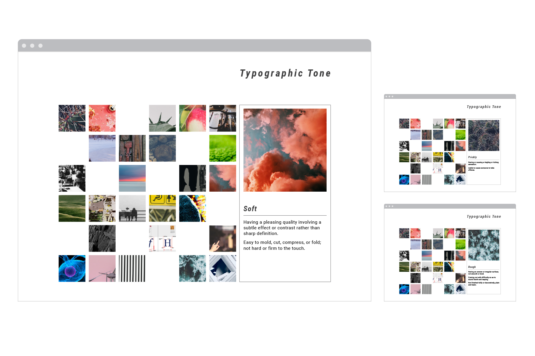
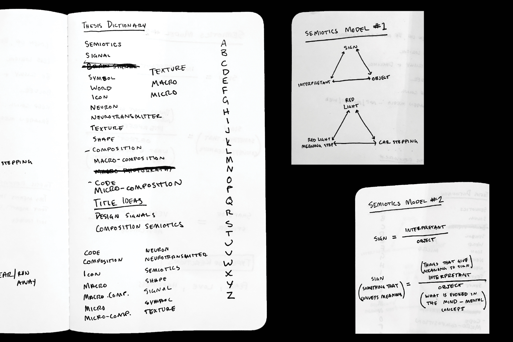
The idea of semiotics led me to a study on words and images that convey the same meaning and evoke an emotional response. A digital dictionary studying tone, typography, and Semiotics. What can be explained with words can also be expressed through imagery and typography—this site identifies the relationship between images and the meanings they convey.

While researching the idea of design and semiotics, I gathered books, articles, and images to read and study, with the intent of curating pieces that explain how grid systems are used throughout design. These writings, and many others, became the meat of my research, and as a result, the main content for the book I produced.
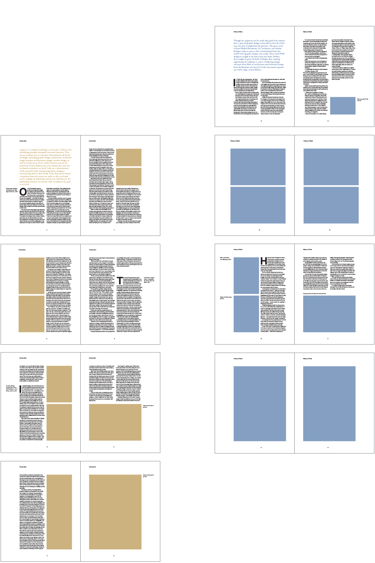
Subliminal Design: Revealing the Grid follows a consistent order. Adding title spreads to begin each section allowed for me to display a different type of grid and introduce a new theme color for each section.
Every section starts with my writing that draws conclusions from my research, shares my own ideas about grids in design, and ties together the content within each section. A consistent and rhythmic hierarchy provides varying interest on each page by use of the two typefaces chosen for this book, bold drop caps to begin each curated excerpt, and the use of two different caption styles for text and images.
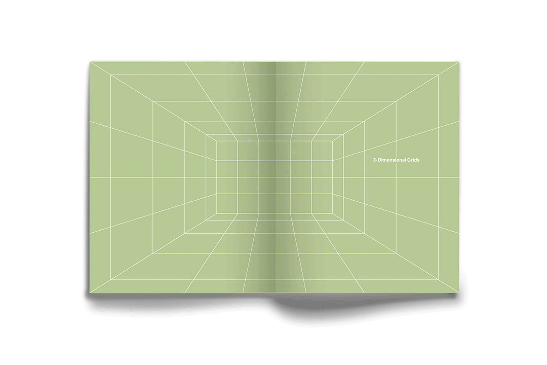
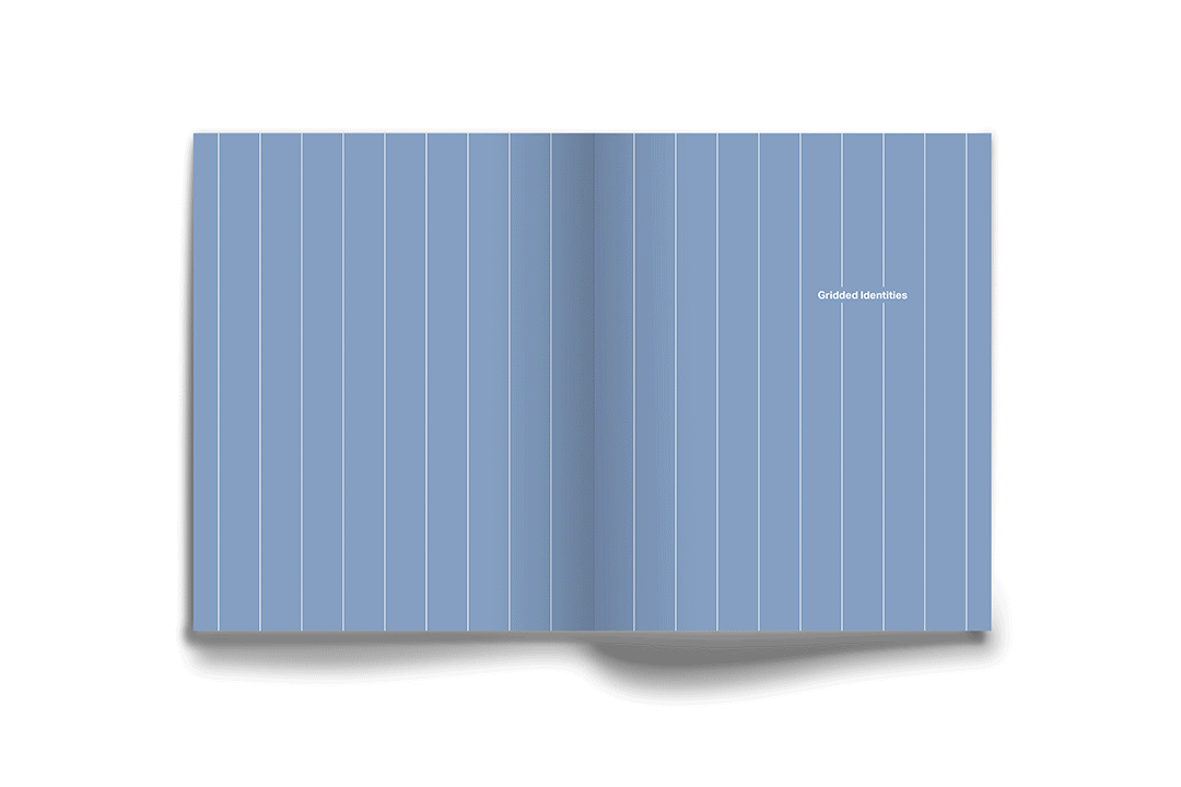

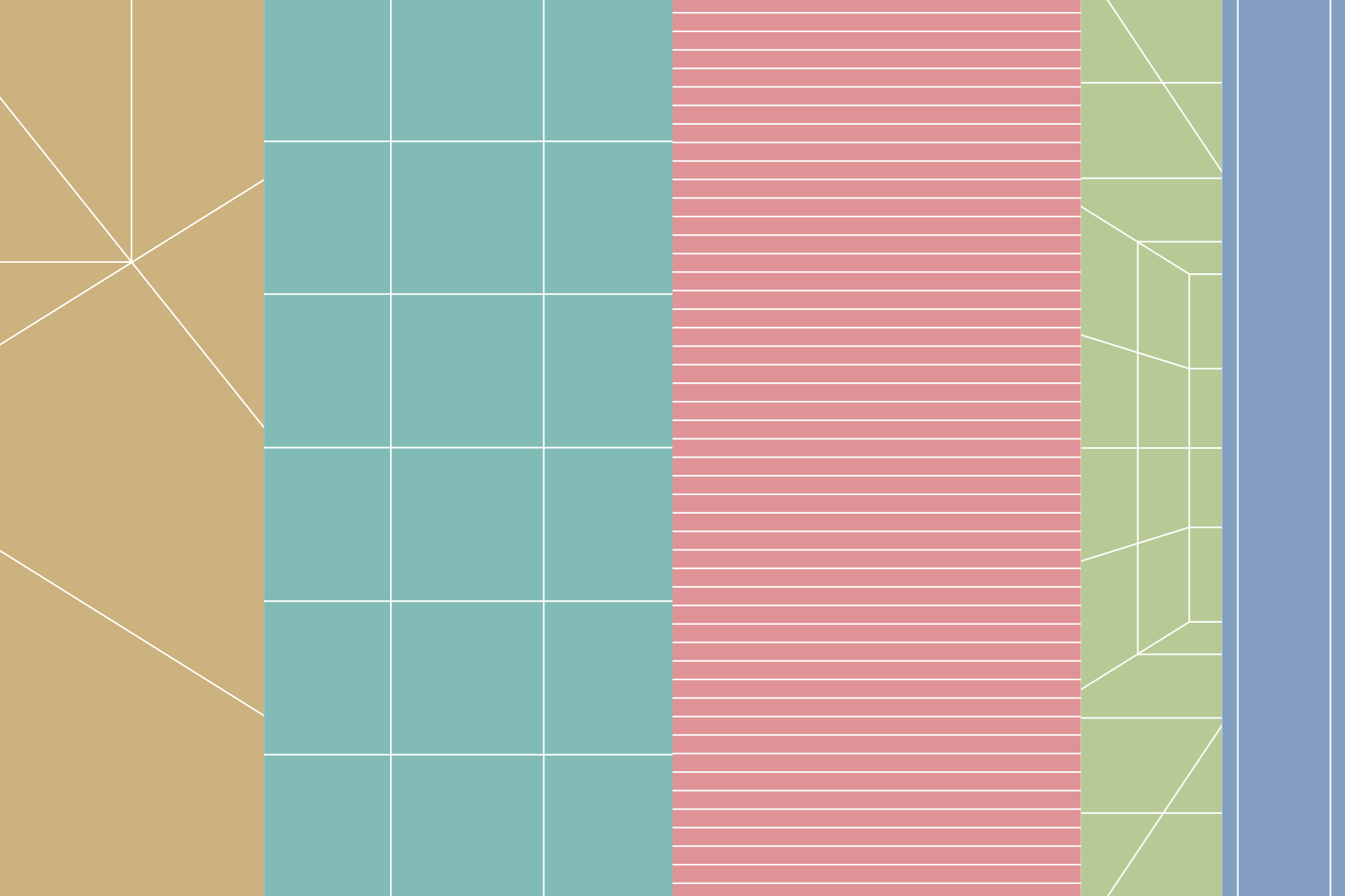
Each section of the book starts with a title spread, which displays a different type of grid. From left to right: Page Harmony, Tile Grid, Baseline Grid, One-Point Perspective Grid, and Columnar Grid.

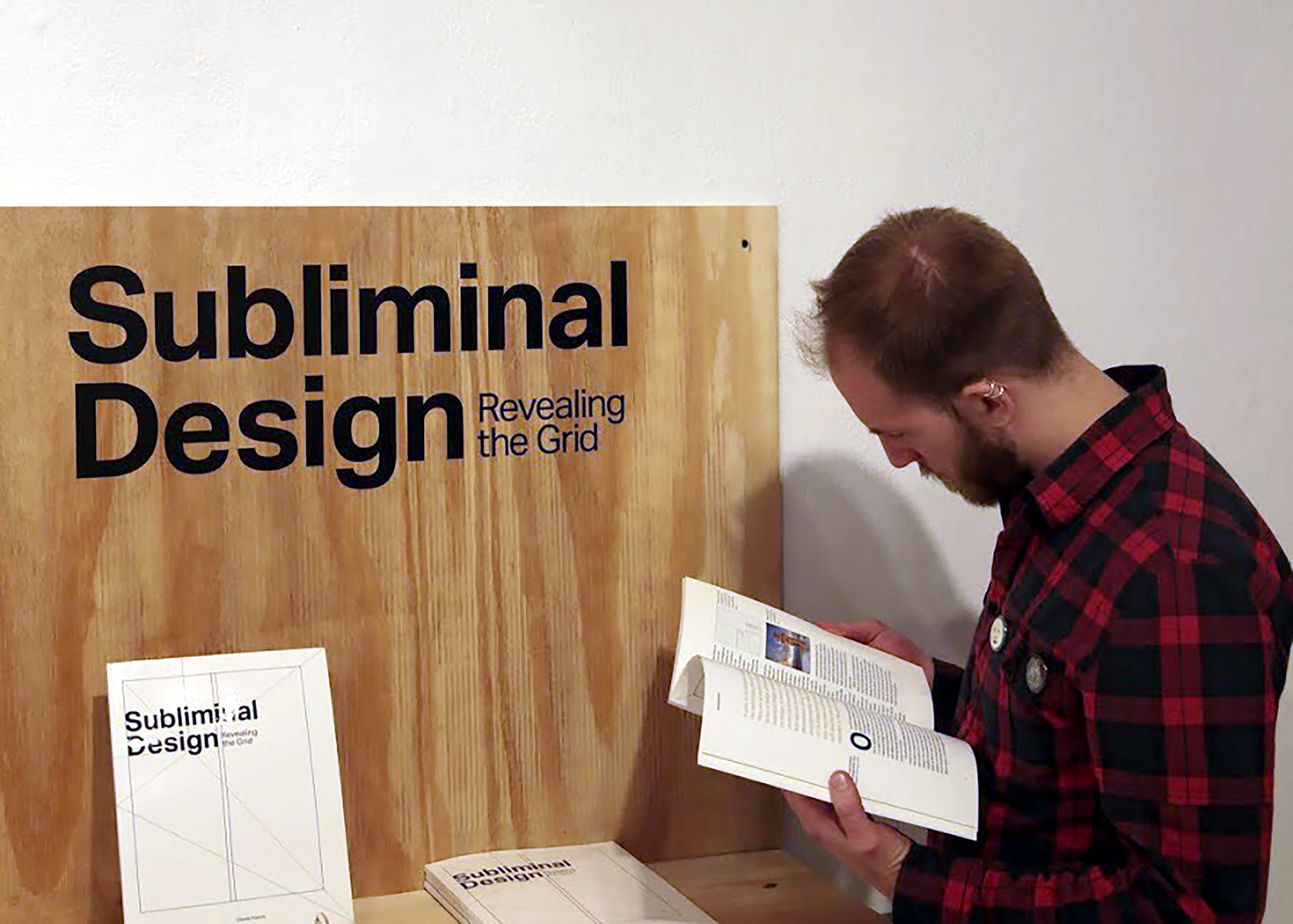
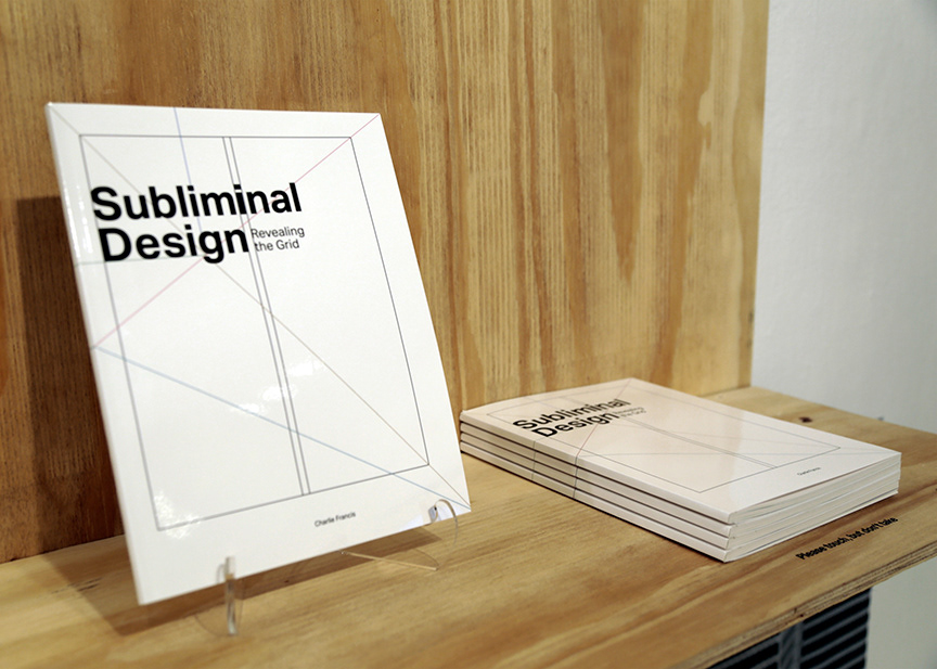
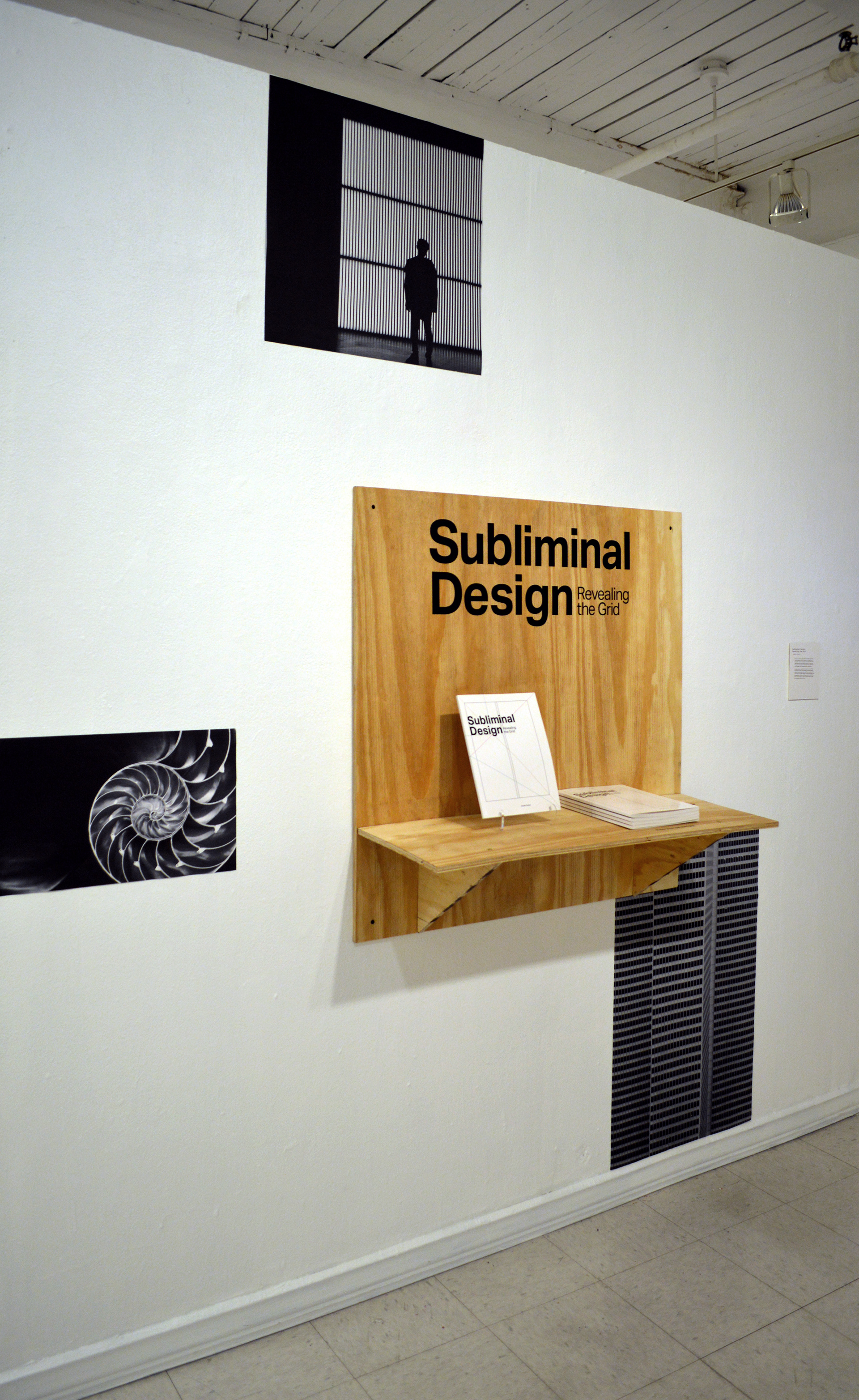
The exhibition was the time to show off the graphic design skills I have been working on during this projects, so it needed to call attention to that. A very subtle grid of photos was displayed on the wall to relate back to the subject of the book, while also providing interest. The photos were extracted from the book itself and were all black and white.
To create an eye-catching focal point, I needed something to disrupt the consistency of the photos. I built a square shelf out of unfinished plywood to create contrast and draw people in, thus wanting to interact with the book.

DIRECTION: TONY VENNE / MAUREEN WEISS