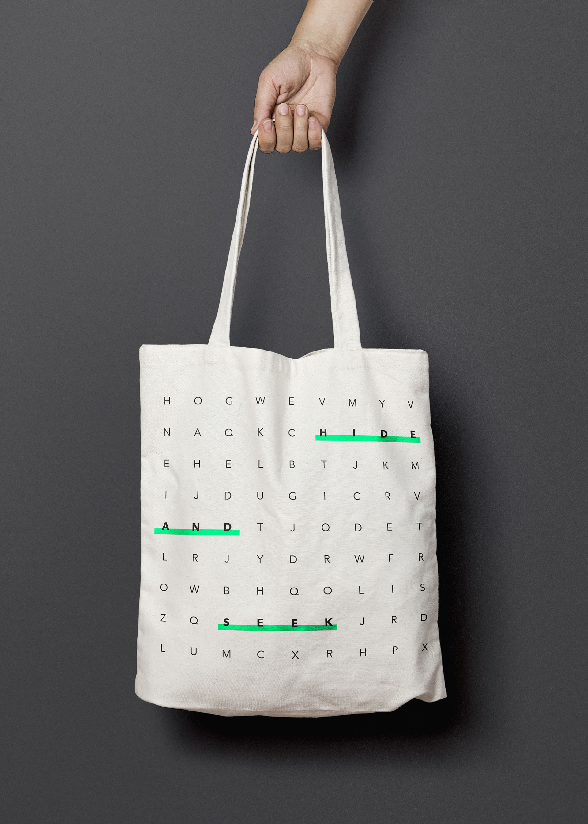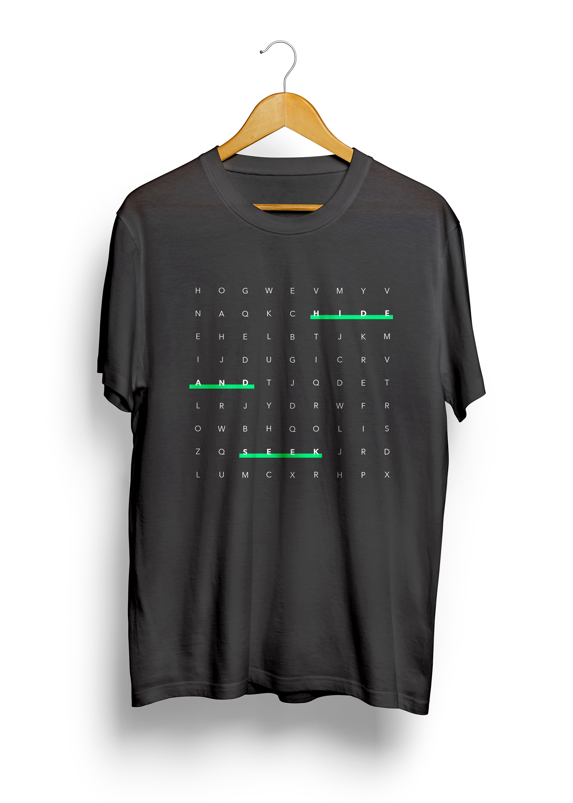


Hide And Seek
A typographic, responsive website design.
Hide And Seek is a 3-day summer camp for adults who want to enjoy a favorite childhood past-time, with a thrilling twist. The website design uses typography to communicate the events of the summer camp as well as the general atmosphere. The desktop version of the website uses a multi-columnar grid to organize the content, while the mobile version uses a single-column grid system. Information jumps around to different locations on each page to simulate the playful idea of 'finding' and 'seeking'.
Direction: Maria Habib